#17 – #25 – Before/After: Been a (re)touch busy
Sorry I haven’t kept the blog up to date recently – I’ve been a bit busy (but still retouching). Be warned – image heavy post after the jump (images #17 to #25, and some other work, yikes!)
My apologies for the absence! I did intend to update after finishing each image, but every time I sat down to write a post about the images – I got distracted and started working on a new image instead! You can say that I’ve been on a roll. 😉
Sander
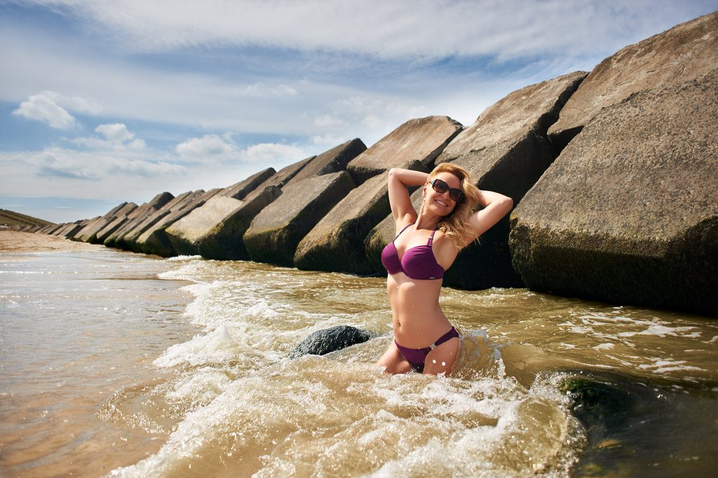
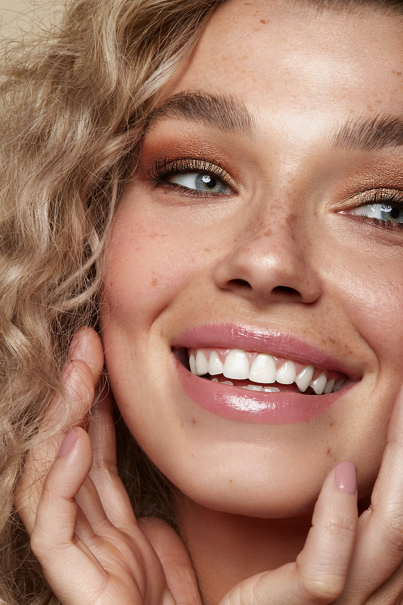
After completing Maëva’s wonderful photo from Santorini, I first completed a set of five test images for Sander De Jong. I am extremely grateful that Sander took the chance with me, and he was lovely to work with. He provided plenty of notes regarding what changes he wanted to see, and what his inspiration was, and Nancy is an absolutely stunning model! I learnt a lot working on these images, but ultimately I also learnt what direction I want to go in regarding retouching (for the moment) – beauty and portraiture.
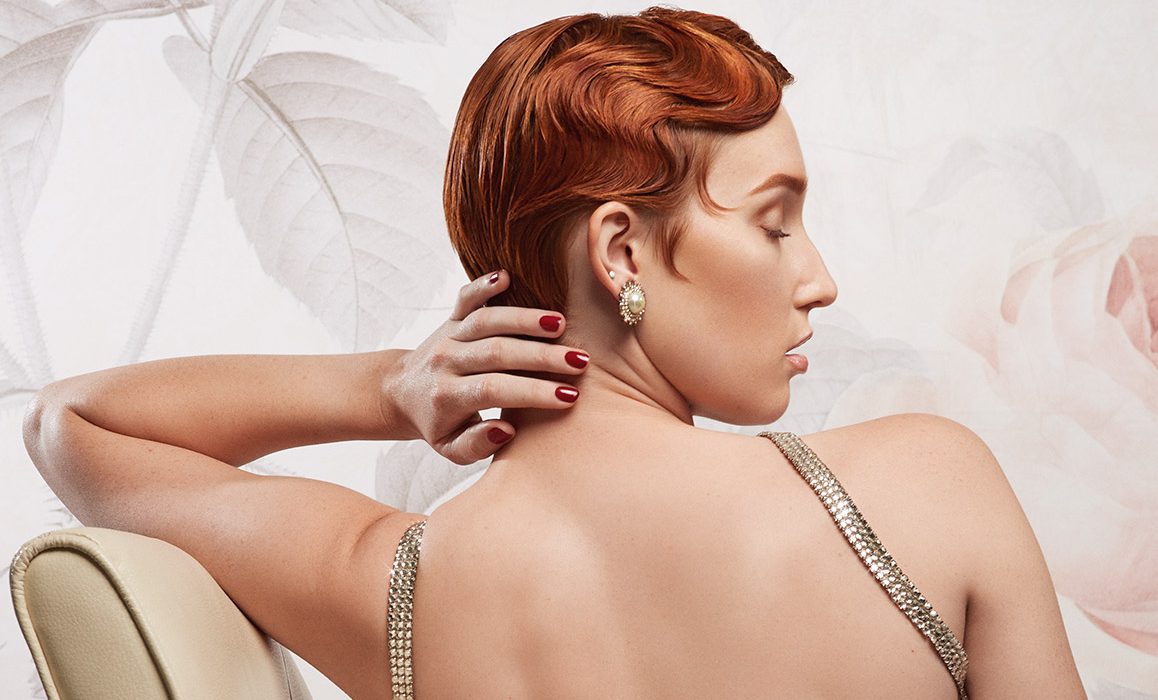
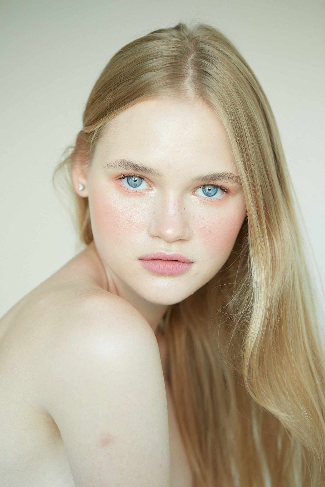
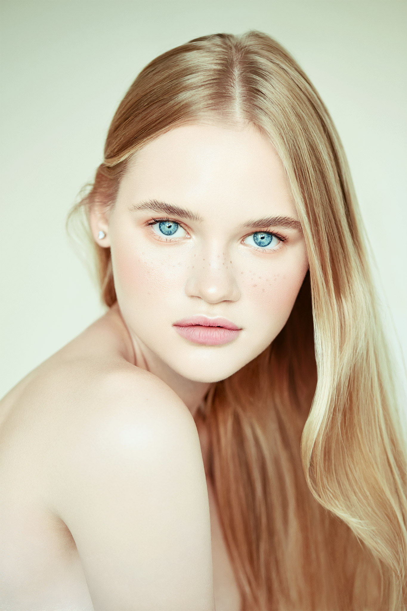
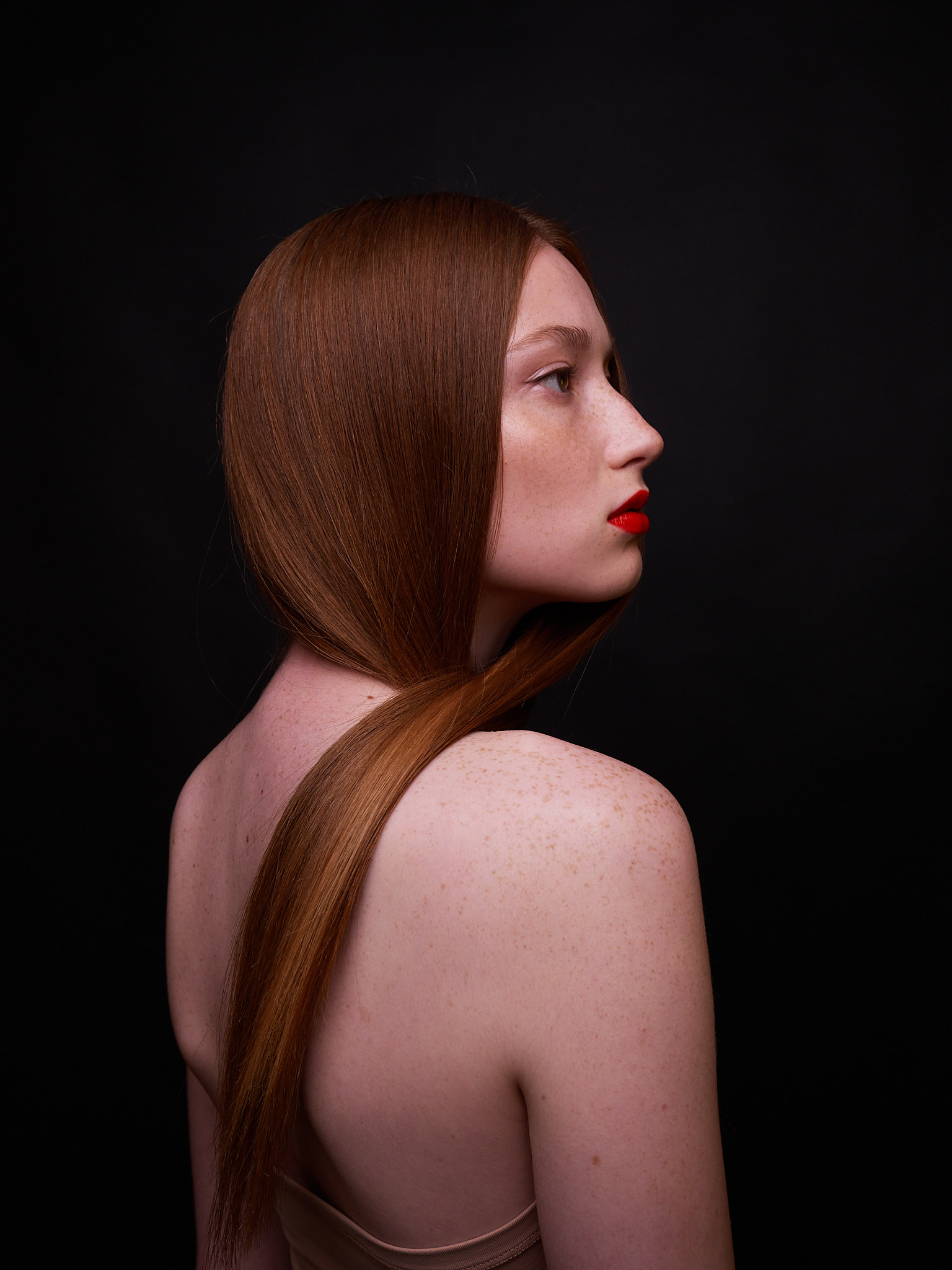
Tawny (#17)
At the very end of November, I moved onto working on this gorgeous photo by Tawny C. Horton. It was a valentines day themed shoot, and after emailing her Tawny specified that she’d like to see pink tones. So I tried my best.
I really gravitated towards this set – and especially the image below – something about the pose reminds me of Man Ray’s Le Violon d’Ingres. Most likely just because it’s a back, but who knows! I thought it was a gorgeous photograph, and very 1920’s (hair) – 1930’s (dress). Innisfail (my home town) is known for it’s Art Deco architecture which was built after a devastating cyclone knocked the entire town flat (apart from something like two buildings?).
In this image I’m still trying to figure out colour grading (and I still don’t have a grasp on it, but hopefully I’ll get better as I go along).
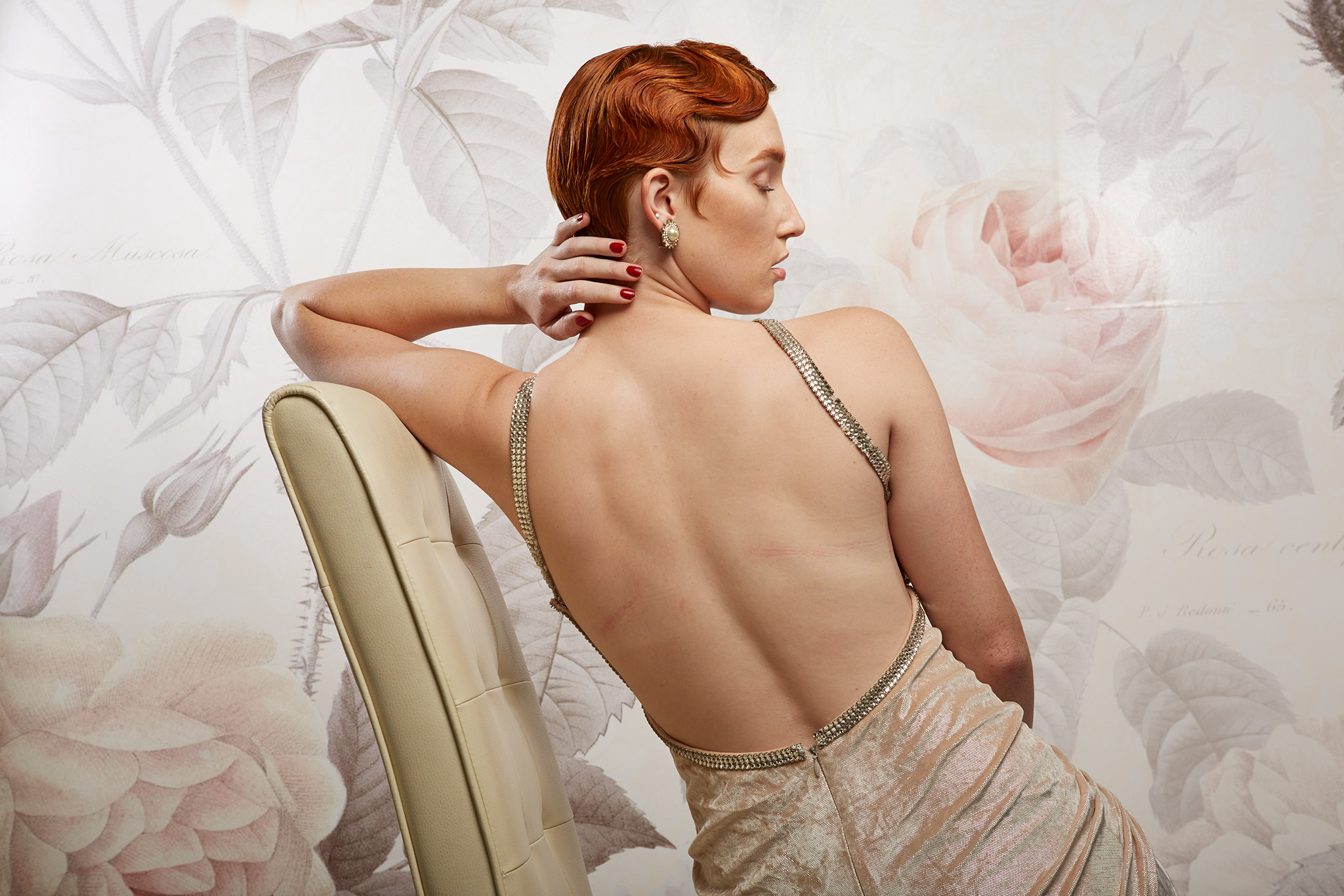
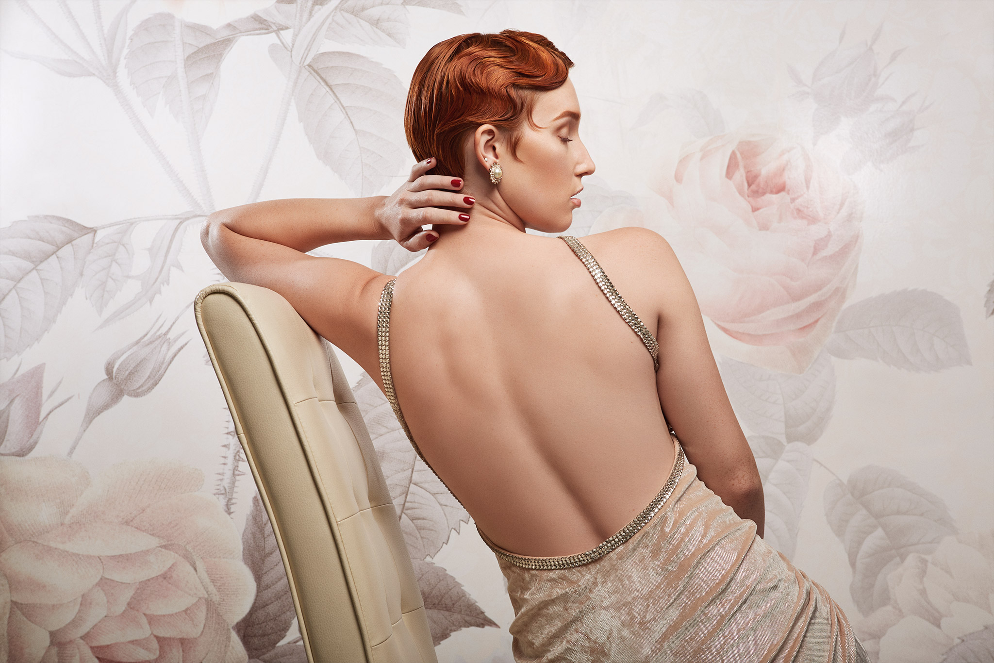
I found the back zipper to be unsightly, as well as the break in the rhinestone band. To fix this I used Earth Oliver’s Frequency Separation 2.0 to edit out the zipper, and the clone stamp (and lots of masking) to fix the missing rhinestones. Looking back on it now, I do think that I could have done much better, but I did what I could at the time. I do like that I made the rhinestones more sparkly though, and removed the greenish cast from the image (I shifted it more towards magenta). This was also the first image where I started to retouch the hair – just a little bit because I was very, very timid!
Iulia David (#18)
At the beginning of December, while I was scouring the web for free RAW images to practice on (I didn’t want all the same images as everyone else on Model Mayhem), I came across a new set by Iulia David. I found this particular image to be extremely challenging – and it was massive. Like, once I imported it into Photoshop from Capture One it was something like 6000+px on the short edge. The amount of detail that this afforded just blew my mind. I had never worked on an image this high res before.
For a short while it had me stumped as to how I could fix the teeth, and the lines on her forehead (without really stuffing up the highlights). There was a fair bit of liquify involved on her teeth, as well as a solid fill layer set to colour. I left a little of the model’s natural texture on her cheek – my aim was to make it seem realisitic, but better. I didn’t want it to be highly obvious that this image had such extensive retouching applied to it.
I’m really glad that Iulia put these RAWs out there for people to edit – it was certainly a bit of a bell curve! As of yesterday this image also gained an FPI on PurplePort which has left me flabbergasted – but more on that later.
Andrew Mashkov (#19, and #20)
Let me preface these two images with the details of the uber talented people who made this series of images happen:
Photographer: Andrew Mashkov
Florist – Lyudmila Koreshkova
Hair style – Svetlana Kostina
Mua – Zhanna Baluha
Model – Alina Levkina
These two images came from an extensive series created by the talented people above on Model Mayhem. I wouldn’t have normally seen them I think, if it wasn’t for the fact that people like to practice thread necromancy on that forum! 😂 What compelled me to give them a shot was the beautiful model Alina, and all those gorgeous blue flowers (which would, in the end, make my job so much harder). Alina’s stray hairs were all tangled up in those flowers, and it took an age to heal and clone them all out.
With these images I tried really hard to keep the colours consistant. I think I have achieved this for the most part, except that Alina’s skin appears more pink in one image than the other (even though I used the same settings in Capture One and same adjustment layers in Photoshop). These were also the images where I taught myself a new way to colour correct initially – by cranking the vibrance (or saturation) sliders in my RAW processor, checking for a strong colour tint, and adjusting the colour temperature and tint accordingly.
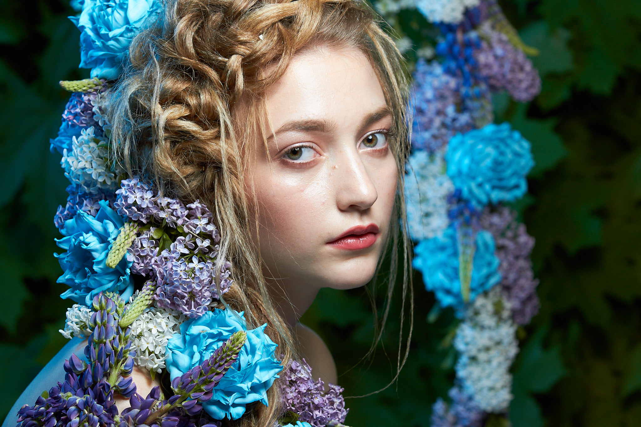
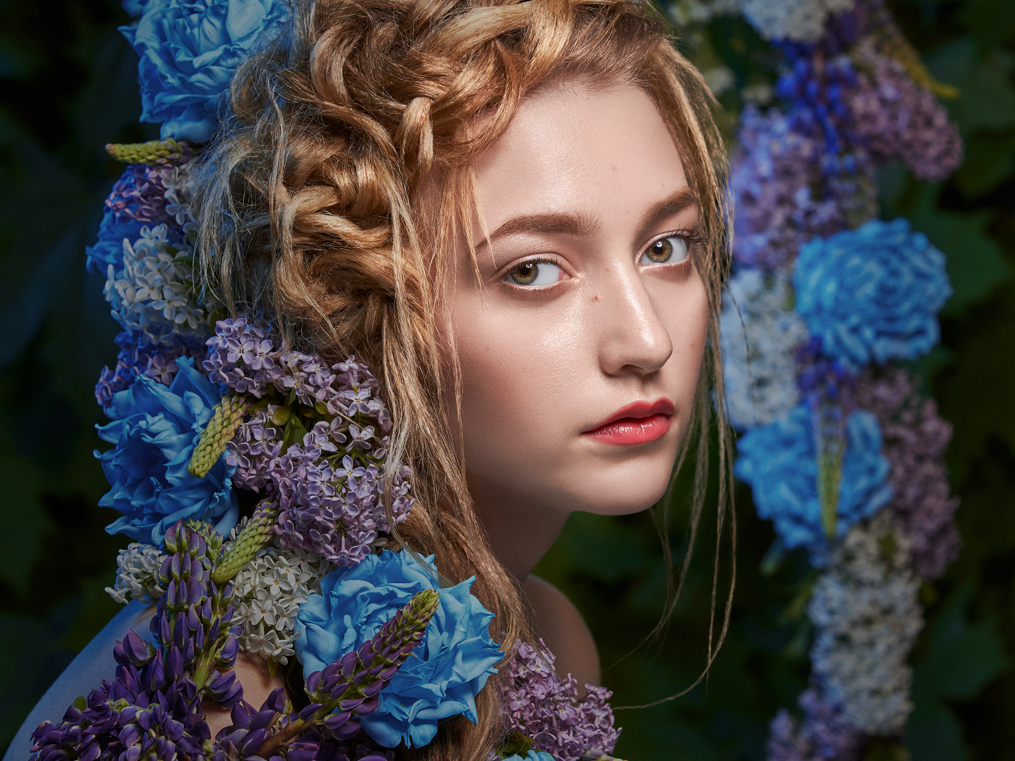
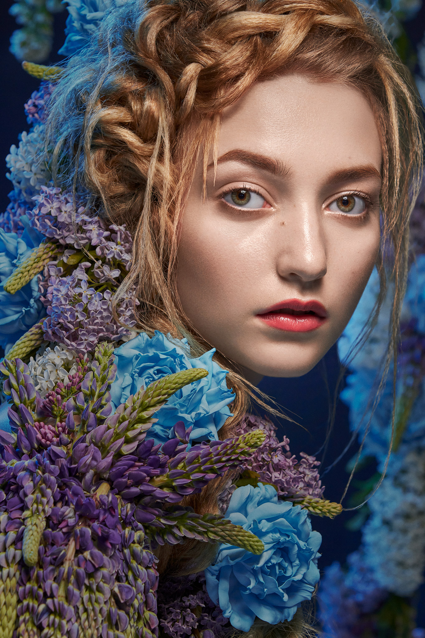
On reflection, I think if I were to revist these two images again, I would work on the eyes a bit more. To me, the whites of the eyes seem too grey, too dull, and too flat. I shouldn’t have dodged and burned the eyeballs so much – and after these images I did ease up on this practice (for now at least haha, this may change in the future depending on whether an image needs it or not). I’m also a bit unsure about the highlight under the eye – should I have left it, added it to the other (that I took away), or removed it entirely? What are your thoughts?
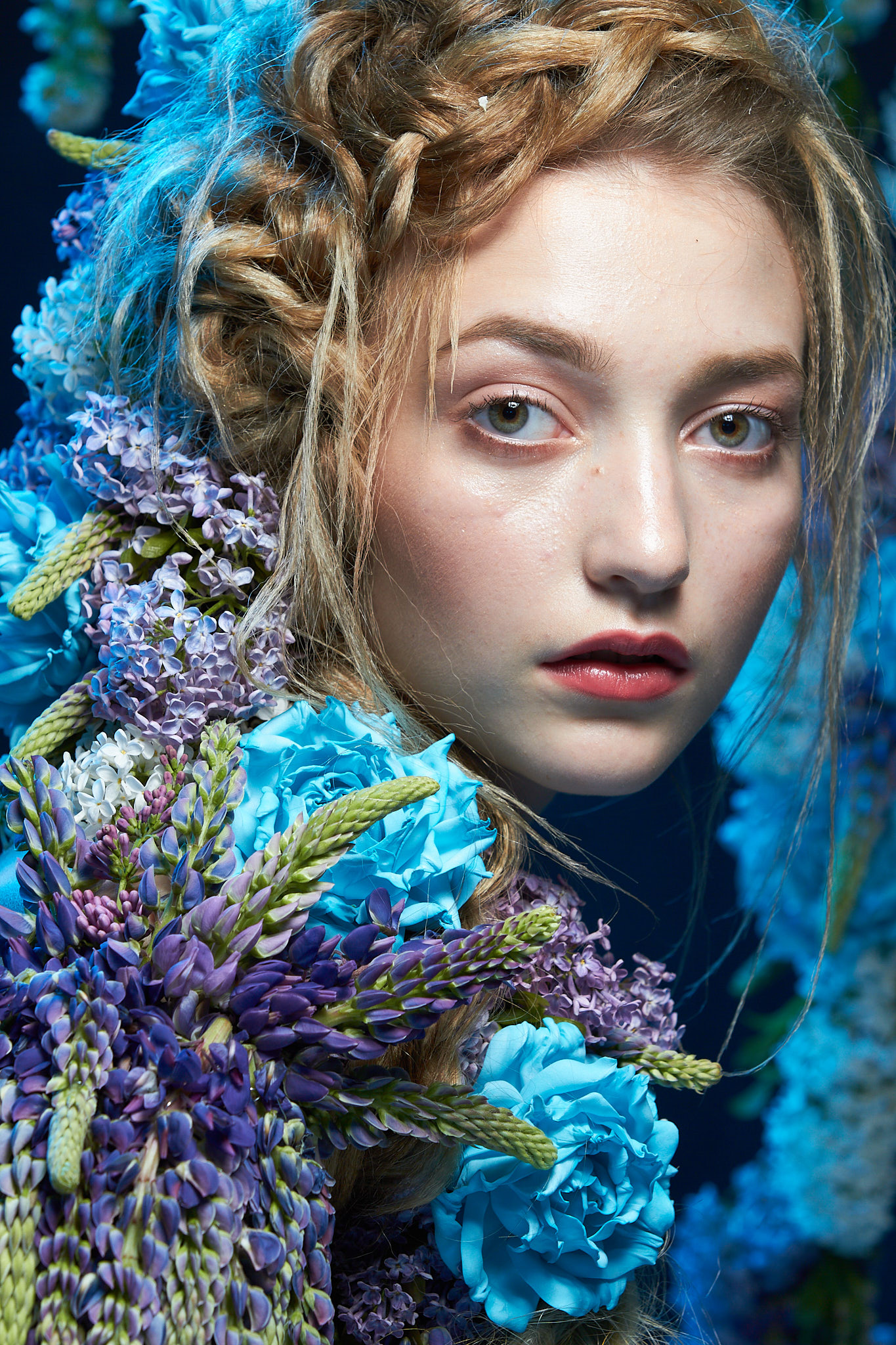
For shits and giggles I also changed it to a different colour grade later on:
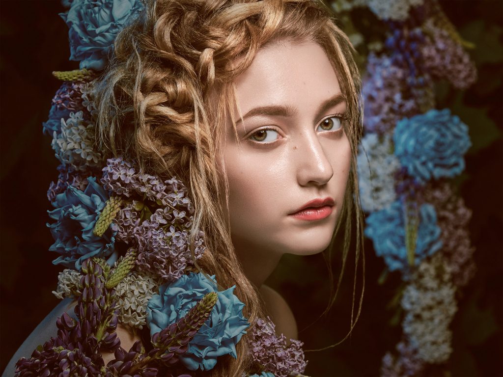
Cranking down that blue, and making it more warm and crushed overall. 🤷♀️ A different feel, I guess.
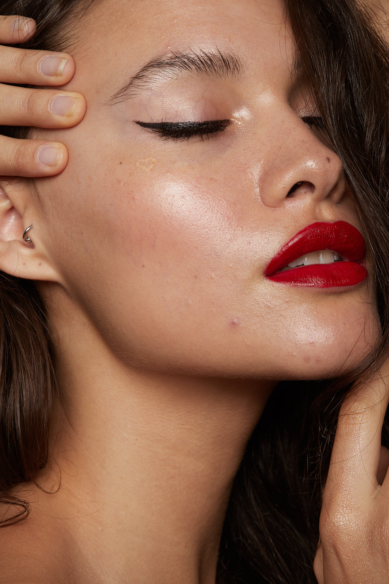
Signature Edits (#21)
This image had been sitting in my to-do folder forever. Since I started this whole retouching thing! I knew I evenutally wanted to retouch it, but I was so intimidated by it. For a long time I had no idea where to start – I would open it up in Capture One, look at it, panic, close it, and move onto a different image. I just wasn’t confident in my ability.


I am really impressed with the stark difference between the before and after though – I think I did a good job. I posted this up on reddit afterwards, and there was some super helpful comments about where I can improve and I have taken them on board – for example some of the coolish tones in the skin, and the fact that I removed the cuticles entirely (which should be left. I didn’t know this, and my research on Pinterest wasn’t much help this time alas). Asides from these few small things I love the fact that the image came out so natural and clean. It was around this time (boxing day to be exact is when I started this image) I heard about, and bought, Exposure (Alien Skin), and it was on this image that I applied an adjusted Portra 400nc grade. Portra is a lovely filmstock for skin – I’ve used it in the past (but I’m a shit photographer, so that’s enough said of that).
Iulia David (#22)
Late December and I was on a roll! A mere three days after starting the image of the hands and nails I was done, and starting on image #22 – this lovely image by Iulia David.
This image came from the same set as image #18, and like image #18, it was massive. I deliberated, and tried different techniques to edit over the course of a couple of days, to edit the model’s bottom lip – it was just irking me. Ultimately I ended up pushing up the bottom lip, and pushing down the lipstick to cover it. I also removed the model’s facial tattoo and earing – I wanted to focus more on the glass skin and the bold red lip contrasting with the luminous skin and dark hair. I was also naughty and removed the mole on the tip of her nose – I felt that it distracted from the other elements of the image.

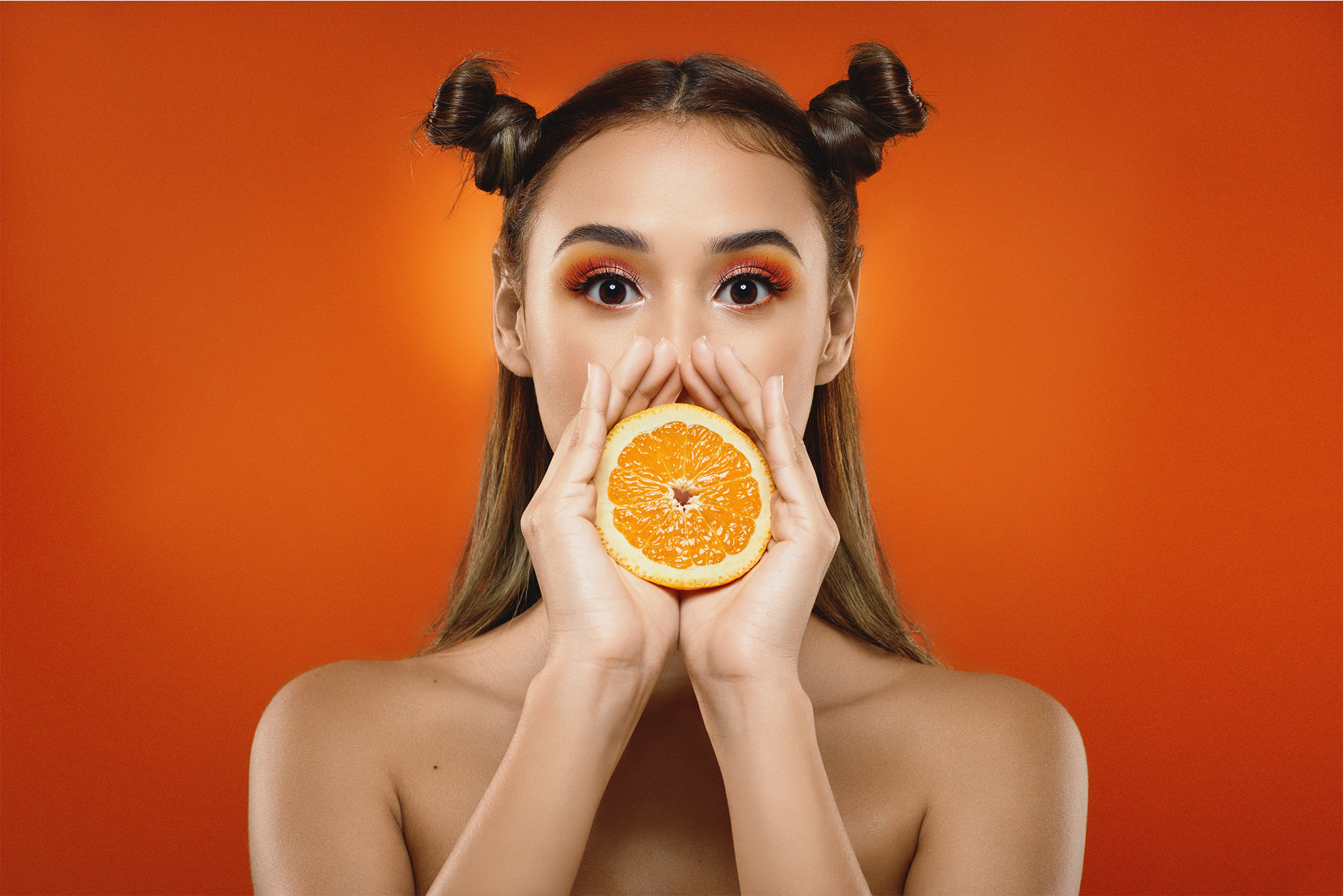
Diego Segovia (#23)
Beauty Orange was the title of this series that was uploaded to Model Mayhem. This model was just so stinking cute. Her hair, her expression, and the overall subject matter was just… adorable.
This was one of the first images I uploaded on Purple Port in order to join – and it won an FPI last Saturday. I never, ever, ever expected it. I honestly don’t think I’m deserving of winning anything – I’m just a newbie, I’m just learning, and I’m really not good enough. I just edit. I don’t create the images. I don’t organise, use the camera and understand the settings and light and models and all that jazz, and well, Purple Port just oozes with talent – and I am not up to that calibre yet. Don’t get me wrong, I am so very grateful, but I’m just… what.
I’ve never won an award before.
I have heard my entire life that the rest of my family is so much more talented, clever, beautiful than me. So I’m just confounded.
But thank you to everyone. I’m yeah, really floored.

I will say this however – Purple Port is pretty damned amazing. It’s great to see all the talent and discussions on there, and I’m really enjoying interacting with people who are interested in the same thing I’m interested in. I’ve even met another retoucher based up this way (Retoucher Cam) and his work is so inspiring! I highly recommend checking it out, if you haven’t already. It’s much more energetic and full of life compared to a lot of forums that I have looked at (I’m still not on facebook haha).
Roman Turchak (#24)
Moving into mid January I decided that I needed to focus more on learning how to retouch hair. It is an important element of beauty and portrait imagery after all!
I was browsing through my folders looking for something to practice this on, and I found this image by Roman Turchak. I’m pretty certain that I originally downloaded the RAWs from Model Mayhem, but I can’t find the thread, and I was an absolute dolt and didn’t save any of the links or anything, did I?
So here we are. An image with only a name, but no links to the original photographer. If you happen to know who they are, or their contact details, please let me know. I’d love to credit.
The entire time I was working on this image, I was cursing the hair! Especially the clump of fly away hair near her neck. I tried and tried and tried to get it right, but to no avail.
So I went back, and I did something that I hadn’t done for a long time, and that all the tutorials I read said not to do.
I broke out the frequency separation.
That fixed it, to a degree. I then had to fudge around a little bit more, but I got there in the end. I also purchased the Hair Retouching masterclass from Retouching Academy at this time by Michael Woloszynowicz – I super reccommend it if you haven’t got it already. I learnt a whole heap more tecniques from this course (and I haven’t actually finished it yet).
During the time I was working on this image, while I was at work at the workshop, I came across a video on Youtube by Dennis Dunbar. It was all about colour grading and correction, and it was amazing. In it he discussed a heap of different ways to colour grade, including using the Adobe Colour Panel inside of Photoshop.
Sadly, this was discontinued in the middle of last year, so I reached out to him.
Thank you Dennis for answering my questions and leading me in the right direction. 😊 I applied some of his tips and tricks to this image, and I hope it turned out alright.
The image was very green to start with, so I decided fuck it and just rolled with it, but hmm. Those eyes. I needed to accentuate those glassy blue pools somehow. So I desaturated the skin, darkened the hair in the area near them, and cranked the saturation in those peepers. While the hair retouch was my goal – my aim was to make you look at her piercing gaze.
I think I achieved that.
I did consider changing her lips (they’re not quite straight, especially on the left hand side), but ultimately I decided to leave them as is. Maybe I will revisit this in the future.
Alexander Croft (#25)
If you’ve made it this far through this essay, thank you so very much! Now we’re on to the last image for this gargantuan post (and my “boss” is currently screaming at me, so I better keep this one short and sweet).
This image of Elya by Alexander Croft was also a lesson for me in hair retouching. It took me a fair while to retouch this one, that’s for sure.
My aim of the game for this image was to… give my cousin a complex if she ever saw it. That’s how good I wanted to make the hair in this image to look. The kind of silky, perfect hair you’d see in a shampoo ad full of silicones, or in one of those little hair lookbook magazines you see in the newsagents. I wanted it perfect. And so I toiled. And cloned. And healed. And dodged and burnt.

I left little bits around her face to keep it looking realistic, as well as around her crown. I removed the super strong magenta cast, and cranked the redness of that hair (because I am jelly as a mousy brown of those with wonderful red hair dammit). I tried to accentuate the freckles, and I “naturally” contoured Elya by using a B+W adjustment layer set to soft light and masked in. So she popped, so it looked like it belonged in a hairdressing salon. I cropped in to make her fill the frame more, and desaturated the skin (and her lipstick a bit) to bring more attention to her hair.
I am not a fast worker by any means, but this really did take forever.
But it was worth it.
And hopefully it’s good enough. Because…
Have a great day, and thank you for sticking around until the end. If you have any thought please let me know – I’d love to hear them.
Also, if you’d like to see how I did image #24, let me know. I’m more than happy to share the PSB (’tis big). Also, if you’d like to collaborate (and don’t mind waiting while molasses runs faster than me) and want to do a test image or a TF* feel free to reach out. I’d love to collaborate. 😁
Cheers,
Katanya